
Patient Education Materials: Designing Clear, Accessible Brochures
Introduction
In healthcare, clarity isn’t optional, it’s essential.
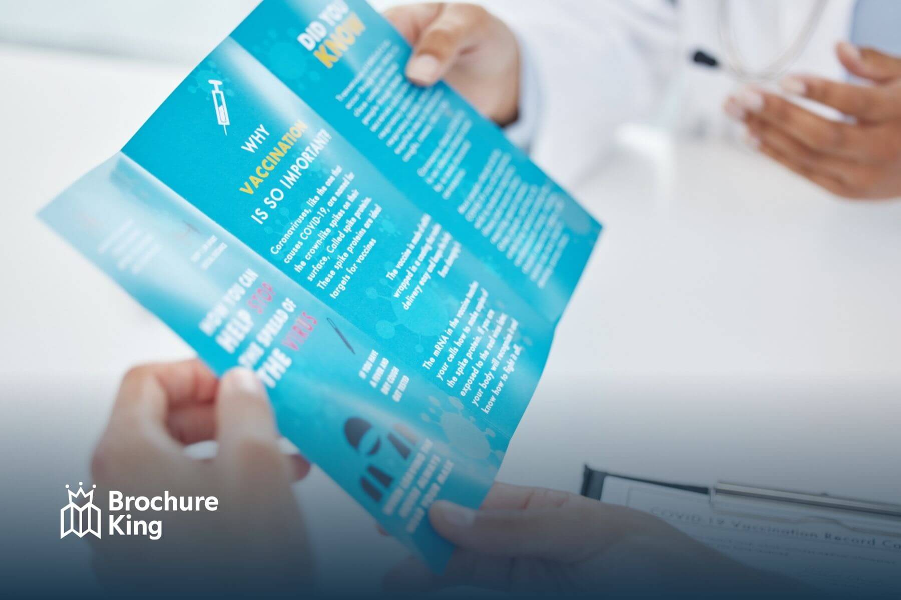
Patient education brochures are often the bridge between a medical visit and a patient’s understanding of what happens next. Whether explaining a procedure, outlining treatment steps, or providing aftercare instructions, well-designed patient education materials improve outcomes, reduce confusion, and strengthen trust.
For small to medium-sized healthcare businesses, marketing agencies, and individual professionals across the U.S., creating clear and accessible patient brochures isn’t just about good design, it’s about responsibility.
In this guide, we’ll cover:
Why accessible patient education materials matter
Core principles of clear brochure design
Compliance and readability standards
Print considerations for maximum clarity
Real-world case examples
How to create materials that patients actually use
Why Patient Education Materials Matter
Research consistently shows that patients often forget much of what they hear during medical appointments. The Agency for Healthcare Research and Quality (AHRQ) highlights that limited health literacy affects millions of Americans and directly impacts health outcomes.
Clear patient education materials can:
Improve medication adherence
Reduce follow-up confusion
Minimize preventable complications
Strengthen patient satisfaction
Lower unnecessary call volume
In our experience working with healthcare providers, clinics that invest in professionally designed brochures report fewer clarification calls and improved patient preparedness.
Printed materials serve as a reliable reference patients can revisit at home.
What Makes a Patient Brochure “Accessible”?
Accessibility goes beyond large fonts.
Accessible patient education materials should be:
Easy to read
Visually clear
Language-appropriate
Culturally sensitive
Physically easy to handle
Designed for varied literacy levels
The CDC recommends using plain language and simple visuals in health communication.
Accessibility increases comprehension, and comprehension improves compliance.
Core Design Principles for Clear Patient Brochures
1. Use Plain Language
Avoid medical jargon whenever possible.
Instead of:
“Administer analgesics as prescribed”
Use:
“Take your pain medicine as directed”
Plain language improves understanding across literacy levels.
2. Aim for a 6th–8th Grade Reading Level
The National Institutes of Health (NIH) recommends patient education materials be written at approximately a 6th-grade reading level for broad accessibility.
You can use readability tools during drafting to ensure compliance.
3. Organize Information Clearly
Structure brochures with:
Clear headings
Short paragraphs
Bullet points
White space
Patients scan before they read. Visual hierarchy matters.
4. Use Visual Aids Thoughtfully
Graphics and icons help explain:
Anatomy
Procedures
Medication timing
Post-surgical care
However, visuals must be simple and directly relevant.
We’ve seen practices redesign cluttered brochures with simplified diagrams and dramatically improve patient comprehension.
5. Prioritize Typography
Typography directly impacts readability.
Best practices include:
Sans-serif fonts (Arial, Helvetica, Open Sans)
Minimum 11–12pt body text
Strong contrast between text and background
Avoid all caps for long sections
High contrast improves accessibility for visually impaired patients.
Designing for Diverse Populations
Healthcare providers across the U.S. serve patients from varied backgrounds.
Consider:
Bilingual brochures
Large-print versions
Color contrast for color-blind accessibility
Culturally appropriate imagery
The U.S. Department of Health & Human Services (HHS) provides guidance on culturally and linguistically appropriate services (CLAS Standards)
Accessible design respects diversity.
Common Types of Patient Education Brochures
Pre-Procedure Guides
Explain:
What to expect
Preparation instructions
Risks and benefits
Post-Care Instructions
Include:
Medication schedules
Warning signs
When to call the doctor
Chronic Condition Management
Outline:
Lifestyle recommendations
Monitoring instructions
Follow-up plans
Preventive Care Information
Promote:
Vaccinations
Screenings
Annual exams
Each brochure should focus on one clear purpose.
Case Example: Orthopedic Clinic Redesign
A Midwest orthopedic clinic approached us with post-surgery instructions printed on dense, text-heavy sheets.
After redesigning into:
A structured tri-fold brochure
Clear headings
Simple bullet points
Visual timelines
The clinic reported:
Fewer post-op confusion calls
Better medication adherence
Higher patient satisfaction
Design clarity reduces anxiety.
Case Example: Pediatric Practice Simplification
A pediatric clinic redesigned its vaccination education materials using:
Friendly icons
Shorter sentences
Larger fonts
Clean white backgrounds
Parents reported improved understanding during follow-up visits.
Small design changes had a meaningful impact.
Print Quality Matters in Patient Education
Clear design must be supported by high-quality printing.
Poor print quality can:
Blur small text
Reduce color contrast
Make diagrams unclear
Undermine professionalism
High-resolution printing ensures:
Crisp typography
Accurate color representation
Durable materials
In healthcare settings, professionalism reflects credibility.
Paper & Finish Considerations
When printing patient brochures, consider:
Feature | Benefit |
Matte finish | Reduces glare under clinic lighting |
Thick stock | Improves durability |
Uncoated paper | Easier to write notes on |
Soft-touch lamination | Premium feel for specialty practices |
Matte finishes are particularly recommended for readability.
HIPAA and Compliance Considerations
Patient education materials must avoid:
Protected Health Information (PHI)
Unauthorized testimonials
Misleading claims
The U.S. Department of Health & Human Services (HHS) outlines HIPAA privacy requirements.
Always review materials for compliance before printing.
Integrating Print with Digital Resources
Modern patient brochures can include:
QR codes linking to instructional videos
URLs to patient portals
Appointment scheduling links
Online FAQ pages
This hybrid approach enhances accessibility.
We’ve seen clinics increase patient engagement by combining print clarity with digital depth.
Mistakes to Avoid in Patient Brochure Design
Overcrowding text
Using overly technical terminology
Poor color contrast
Small font sizes
Ignoring cultural sensitivity
Printing without proofreading
Clear communication is the goal.
Measuring Effectiveness
How do you know your brochure works?
Track:
Follow-up call volume
Patient compliance rates
Survey feedback
Reduced appointment confusion
In our experience, clear brochures directly correlate with smoother patient interactions.
Why Professional Printing Makes a Difference
Small to mid-sized healthcare businesses often underestimate the impact of print quality.
Professionally printed materials:
Reinforce trust
Reflect quality care standards
Enhance brand consistency
Support referral relationships
Affordable online print providers make high-quality production accessible without excessive cost.
Conclusion
Designing clear and accessible patient education brochures is both a communication strategy and a responsibility for healthcare providers across the United States. Effective materials simplify complex information, support patient understanding, and reduce anxiety after appointments. By prioritizing plain language, structured layout, high contrast design, cultural inclusivity, and professional print quality, small to medium-sized practices and marketing agencies can produce brochures that genuinely improve patient experiences. When thoughtfully designed and printed with care, patient education materials do more than inform, they build trust, reinforce professionalism, and support better health outcomes. In healthcare, clarity is not just good design, it is essential care.
At Brochure King, we help healthcare providers, agencies, and professionals across the U.S. create high-quality, custom patient education brochures and promotional materials. With fast turnaround times, affordable pricing, and professional printing, we make it easy for your practice to deliver clear, accessible, and trustworthy communication.
Elevate your patient materials and strengthen your brand. Contact us or request a quote today!
Frequently Asked Questions
Why are patient education brochures important in healthcare?
They simplify complex medical information, reduce patient anxiety, and build trust by reinforcing professionalism and care standards.
What design elements make patient brochures more effective?
Plain language, structured layouts, high-contrast design, cultural inclusivity, and professional printing ensure clarity and accessibility for diverse audiences.
How quickly can Brochure King deliver custom healthcare brochures?
Brochure King offers fast, nationwide delivery, ensuring small businesses, agencies, and professionals receive affordable, high-quality materials on time.
 Hi! How can we help?